Global Warming Risks
There is No Planet B
Big environmental problems come with high stakes. And when thinking about the range of possible risks these problems might incur, it can be helpful to start with the worst-case scenario. From there we can work our way down to the most likely set of risks we face. This will give us the widest view of what could happen under global warming.
In a not-impossible worst-case scenario where the Earth is heated up to a moist or runaway greenhouse state (discussed in Chapter 8), we would then have caused the permanent collapse of life on Earth. While this is quite unlikely to occur (a 1 in 1000 chance of it beginning to occur over the next 100 yearsOrd, The Precipice: Existential Risk and the Future of Humanity, (2020).), it’s mere possibility shows that the stakes are high. We have the power to inadvertently ruin everything.
Our power of planetary destruction does not come with a counter-balancing power of planetary creation. The only other planet we can even contemplate inhabiting is Mars. Though many people over the past several decades have discussed colonizing and ‘terraforming’ Mars, this is actually a dangerous fantasy.
It’s dangerous because it can appear to absolve us of actually improving conditions on Earth. If we can just inhabit another planet, why bother fixing this one if it appears to be going very badly?
And it’s a fantasy because it’s impossible to turn Mars into a version of Earth. The surface of Mars is irradiated with sterilizing high-energy photons and cosmic rays. With an average temperature of -65ºC, its greenhouse effect is far too small to warm the surface up to Earth-like temperatures. And even if all of Mars’ polar CO2-ice caps were sublimated into its atmosphere and all of Mars’ carbonate rocks were strip-mined and processed to release CO2, its CO2-dominated atmosphere would still be two orders of magnitude too thin to make it as warm as Earth.Jakosky and Edwards, Inventory of CO2 available for terraforming Mars, (2018) Mars is also missing plate tectonics and any substantial amounts of available water, and thus it is impossible for it to have a weathering-CO2 thermostat like Earth; this means that Mars could never self-stabilize its temperature over geological time scales. The very best that human life could ever be on Mars would be like the lives of small groups of scientists near the South Pole: cold, harsh, restricted, and lonely.
So if, through a combination of very poor decision making and very bad luck, we manage to completely ruin things on Earth, there is no planet B.
Global Warming Projections
But what are the most likely risks due to global warming and how do we know about them? Ultimately all knowledge about any scientific area comes from the work of scientists working mostly in teams or small groups. This scientific knowledge is conveyed through articles written by the scientists. The field of climate science is unusual in that it also works collectively through large organizations that coordinate and plan research work and experiments. The largest of these is the Intergovernmental Panel on Climate Change, most often called ‘the IPCC’. The following video explains more about the IPCC and interviews a number of scientists who have worked on the IPCC.
The IPCC has so far generated a new report every 5-7 years since 1990. The latest ‘Sixth Assessment Report’ was released in late 2021. These reports have helped to coordinate a huge amount of research work, especially the coordination of a series of model simulations. This coordination is particularly valuable because of the complexity of the problems and global climate models involved.
To understand the value of this coordination, let’s look at a realistic example. Imagine there’s a small group of 2-4 scientists working together to estimate the impacts of global warming. Typically, such scientists would only have 3 years to work on this project (the usual length of research grants that pay for computing time and student or postdoc or research scientist salaries). The most this group of scientists would be able to do in three years is run a few climate model simulations and do statistical analyses of these results. They likely would not be able to run simulations from more than one or two different climate models and they would have to choose their own simple future scenarios. Because of these limitations their results will likely be highly dependent on the model (or models) and scenario they chose. This means that their conclusions will be fairly limited and not necessarily comparable to other groups of scientists who will be running their own models and their own scenarios for the future. The coordination of the IPCC allows many scientists to agree to a selection of future global warming scenarios and agree to run the same sets of experiments. Thus dozens of groups of scientists can run many dozens of model simulations, all with the same experimental inputs, though using different models. The output of these simulations is then collected together and hosted online so that thousands of climate scientists from all over the world can analyze these standardized model simulations. This means that the results of global warming simulation experiments can be comparable and generalizable and usable by a large number of people. An additional benefit of coordination like this is that the average of many different models is almost always more realistic than any individual model (this is generally true for models across all disciplines of science). Using a broad range of models can therefore give us a sense of what results are most reliable across models.
What are the agreed-upon global warming scenarios? As of the Sixth Assessment Report of the IPCC, released in 2021, there are five general scenarios, each of which comes with its own economic and political narrative. These are called the Shared Socioeconomic Pathways (SSP). The SSPs span a wide range of possible futures. The CO2 emissions of each of these is shown below along with an estimate of global mean temperature from a simple climate model.
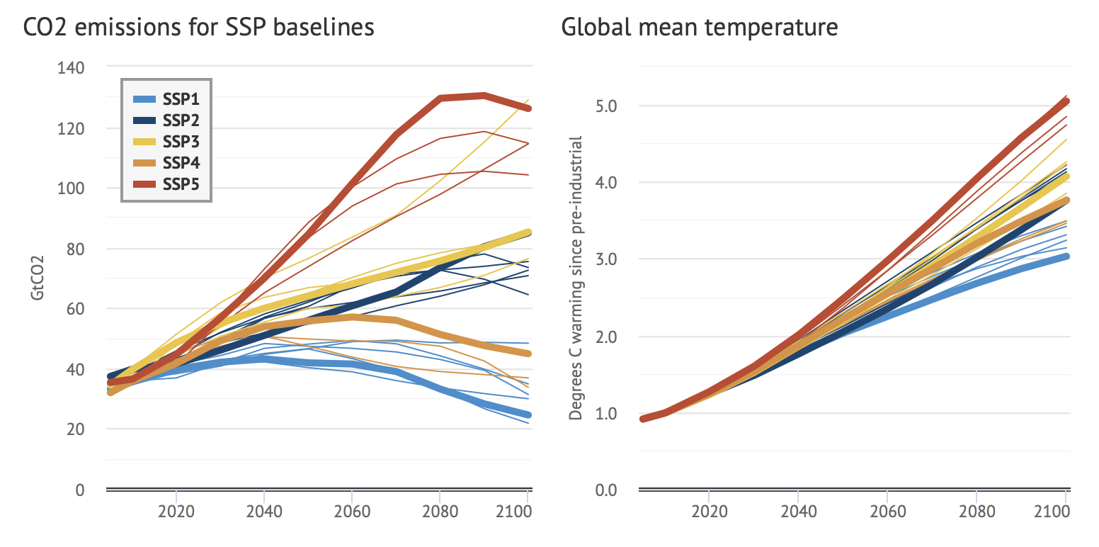
These narratives describe alternative pathways for future society. SSP1 and SSP5 envision optimistic trends for human development, with ‘substantial investments in education and health, rapid economic growth, and well-functioning institutions’. They differ in that SSP5 assumes this will be driven by an energy-intensive, fossil fuel-based economy, while in SSP1 there’s a shift toward sustainable practices. SSP3 and SSP4 are more pessimistic in their future economic and social development. These scenarios have little investment in education or health in poorer countries where there are also fast-growing populations and increasing inequality. SSP2 represents a ‘middle of the road’ scenario where historical patterns of development are continued throughout the 21st century.
The IPCC report doesn’t say that any particular scenario is more or less likely than any another. Independent analyses have indicated that the middle scenarios (SSP2, SSP3, SSP4) are unsurprisingly the most probable. But there are still good economic reasons to not dismiss the low- and high-end scenarios, SSP1 and SSP5; in one study, subjective economic expert forecasts have suggested that there’s a 35% chance that the real future emissions scenario could exceed the most severe SSP5 scenario.Christensen, Gillingham, and Nordhaus, Uncertainty in forecasts of long-run economic growth, (2018). But as Niels Bohr famously quipped, ‘Prediction is very difficult, especially about the future.’
In addition to the baseline SSP scenarios, there are also variations on the SSP scenarios that correspond to specific amounts of total radiative forcing by 2100: a range of values from 8.5 \(\text{W}/\text{m}^2\) to 1.9 \(\text{W}/\text{m}^2\). For example, if a scenario is labeled ‘SSP2-4.5’, this means SSP scenario 2 with 4.5 \(\text{W}/\text{m}^2\) of radiative forcing (a global radiative imbalance) due to greenhouse gas emissions by 2100. In this and the next chapter you will see figures labeled with such scenarios (these scenario variations are indicated with the thin lines in the first figure showing the SSP scenarios above).
Sea Level Rise
Sea level, like temperature, has been remarkably stable over the course of human civilization. Consider this perspective from the past 20,000 years:
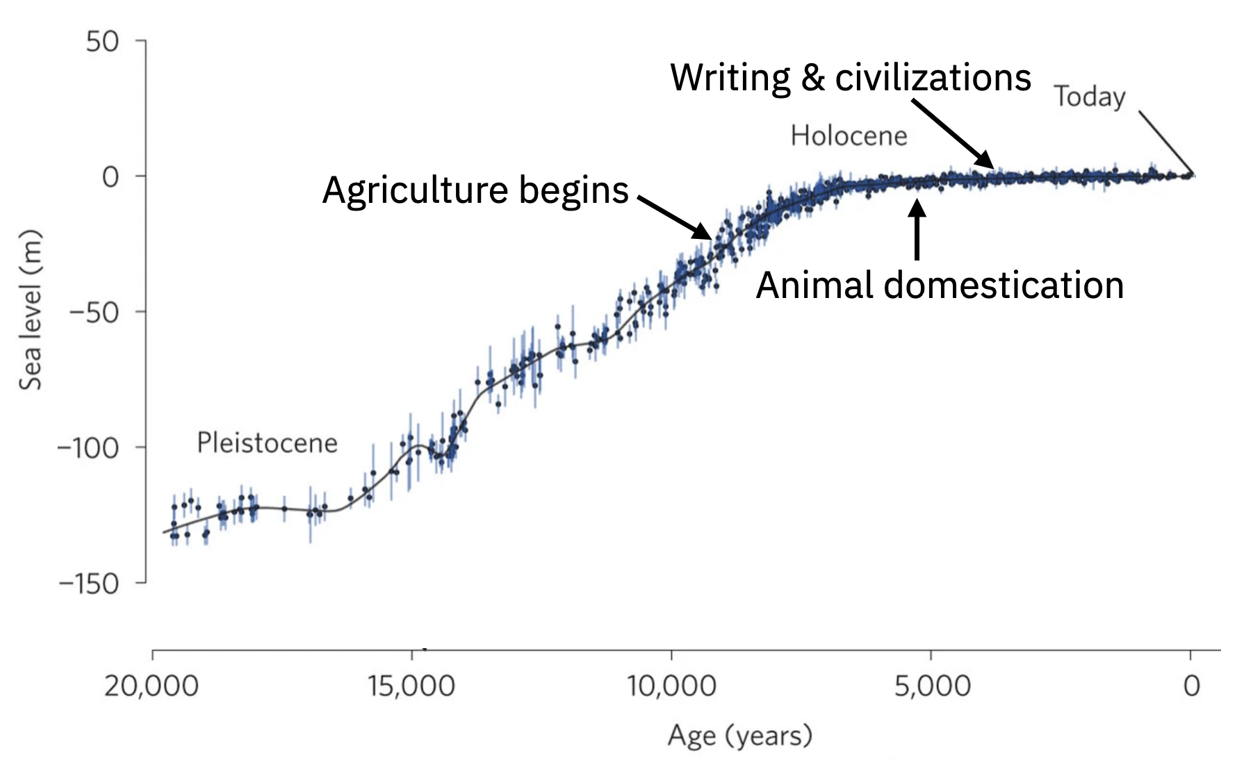
Sea level was about 130 m lower during the last ice age. But from the time that agriculture began, animals were domesticated, and civilizations were constructed, sea level has been very stable. The problem is that we are not like our ancient ancestors, living in small groups of highly mobile hunter gatherers. In comparison, our cities are immensely populous and their form and boundaries are practically permanent.

When the ice sheets of the last ice age melted away from about 20,000 years ago to 7,000 years ago, it caused an average sea level rise of 1 cm/year. Our hunter-gatherer ancestors would have been unlikely to have even noticed this kind of a change. But for a large, modern coastal city, this kind of sea level rise would end up being disastrous.
What causes sea level rise? The two most important factors are the melting of ice on land and the expansion of ocean water as it is heated. Since 1900, the melting of ice on land has contributed twice as much to sea level rise than thermal expansion.Frederikse, et al., The causes of sea-level rise since 1900, (2020). Note that the melting of floating sea ice contributes only a tiny amount to sea level rise.According to Archimedes’ Principle, a floating object displaces the same volume of water as the volume of the part of the object that’s submerged. So removing a boat from the ocean doesn’t change the ocean’s height. The subtle trick with sea ice is that it is less salty than ocean water, so when it melts into the ocean it changes the average density and therefore the volume of the ocean. But this effect is small and so Archimedes’ Principle ensures that there’s only a small contribution of melting sea ice to sea level rise (Jenkins and Holland, Melting of floating ice and sea level rise, 2007).
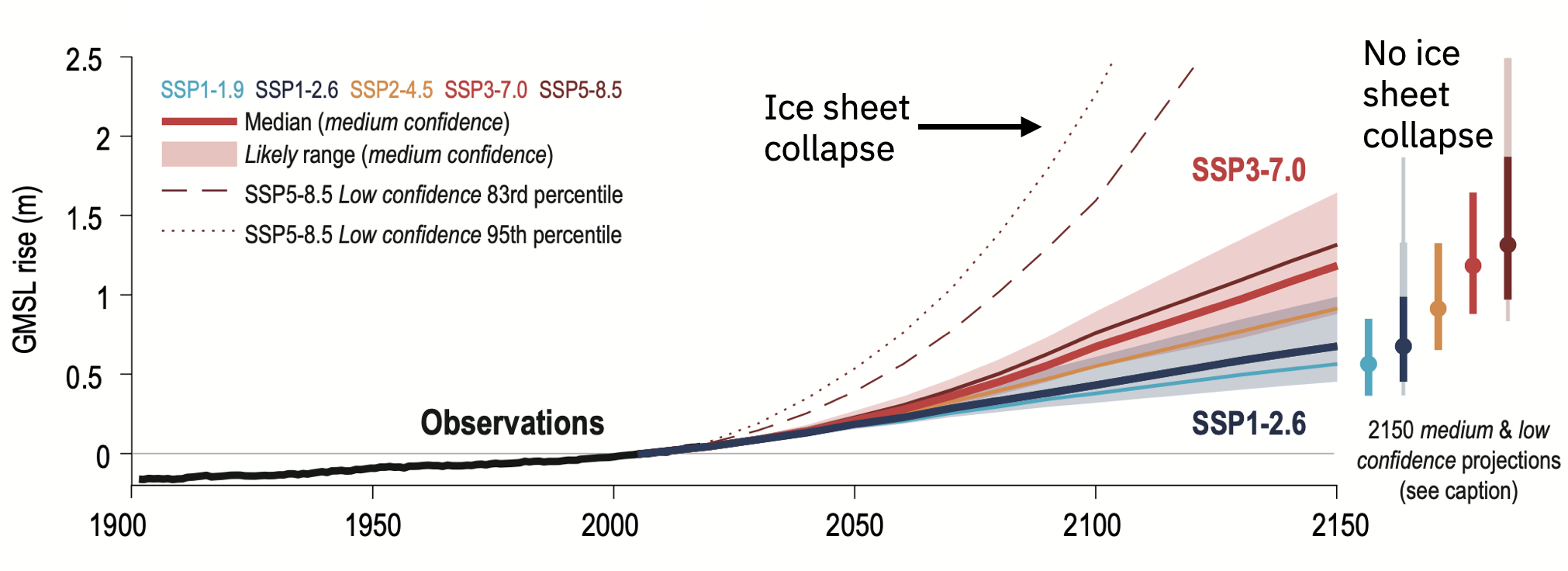
How is sea level projected to change under global warming? Ice melts and the ocean warms and expands, so the sea level will rise. Uncertainty in how much it will rise comes from how much greenhouse gases we will emit and how Greenland and Antarctica’s ice sheets respond to warming. Depending on the SSP scenario, sea level rise by 2150 could be anywhere between about 0.5 m to 1.5 m, see figure below. But if there were a collapse of large ice sheets, particularly the West Antarctic Ice Sheet, then sea level could rise by about 3-6 m by 2150 with many more meters of sea level rise guaranteed to come after that.DeConto et al., The Paris Climate Agreement and future sea-level rise from Antarctica, (2021).
How could a collapse of the West Antarctic Ice Sheet happen and why would it be so impactful? The following video explains the key ideas.
Let’s return back to the long-view of sea level rise that we began this section with. Sea level has been remarkably stable for thousands of years. How will it change in the coming few thousands of years? We’ve learned that because of the relatively slow weathering-CO2 thermostat, extra CO2 will remain in the atmosphere for hundreds of thousands of years, so it can continue to have an impact far into the future. Ice sheets also respond very slowly to temperature changes and can continue to melt for many hundreds of years even though the warming may have ceased. Depending on how much carbon we burn, from approximately all known usable fossil fuels (~5000 Gton C) down to about ¼ of all fossil fuels, the eventual sea level rise will be between about 25-50 m (figure below).
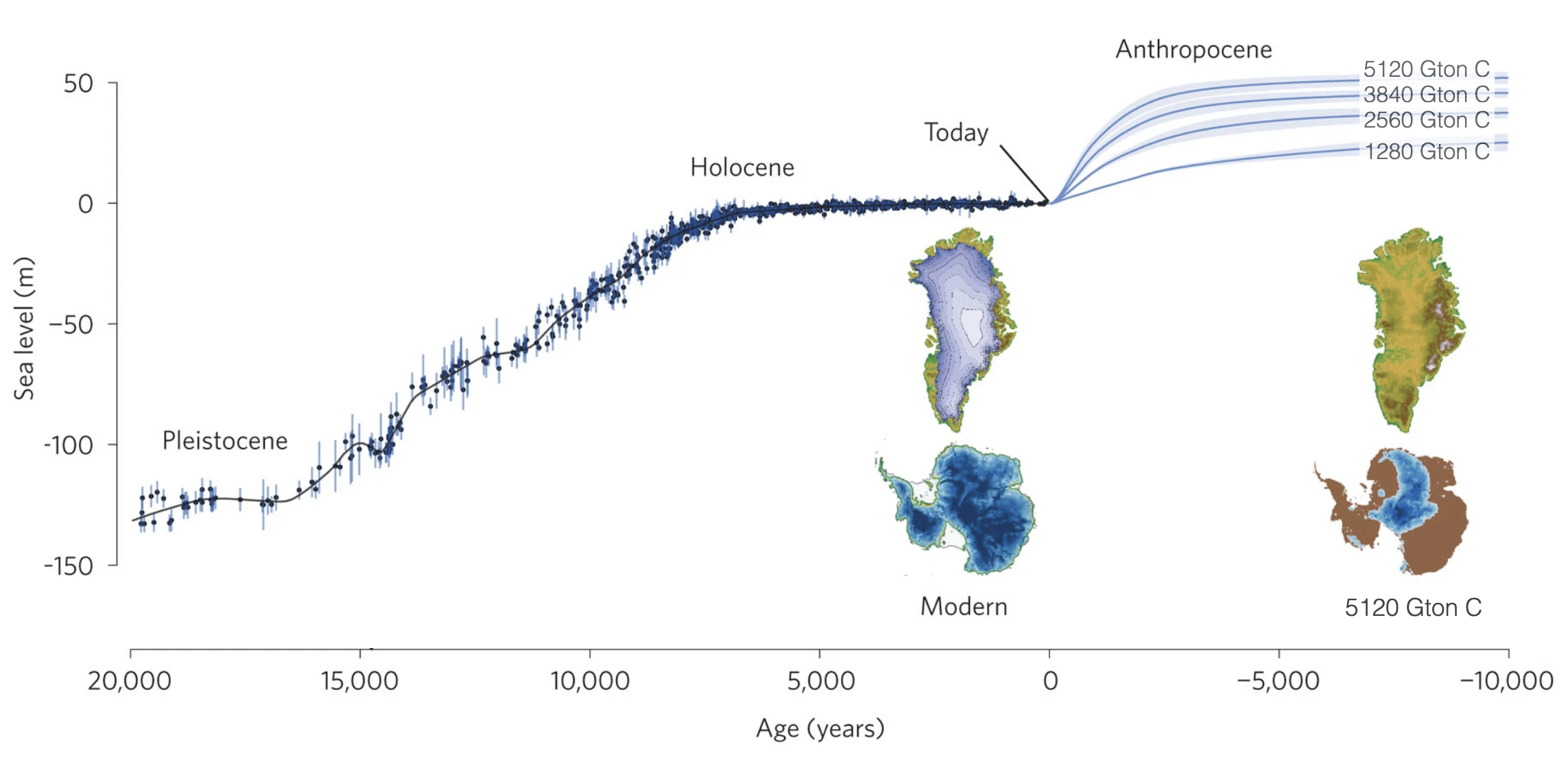
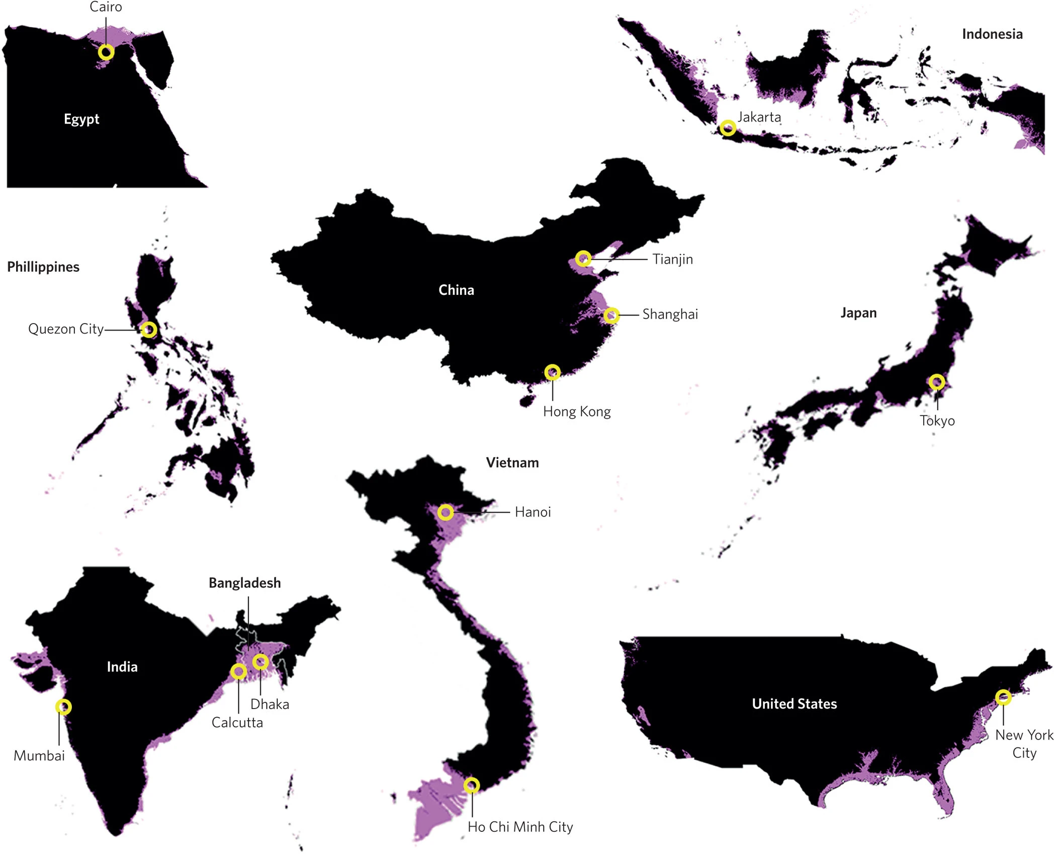
The lowest of these four scenarios above (1280 Gton C) results in 25 meters of eventual sea level rise. Since 1750 we’ve already burned approximately 600 Gton C, so we’re already half way to this lowest of the four emissions scenarios. Twenty-five meters of sea level rise is enough to bury all or significant portions of many of the world’s largest major cities, see the figure below.For example, Tel Aviv has an average elevation of 5 meters and a high point of about 20 meters, so it would be completely submerged by 25 meters of sea level rise. Unless we keep the large majority of the usable fossil fuels in the ground, in several hundred to a thousand years we will have to abandon or massively engineer nearly all of the world’s coastal cities.
Heat and Humidity
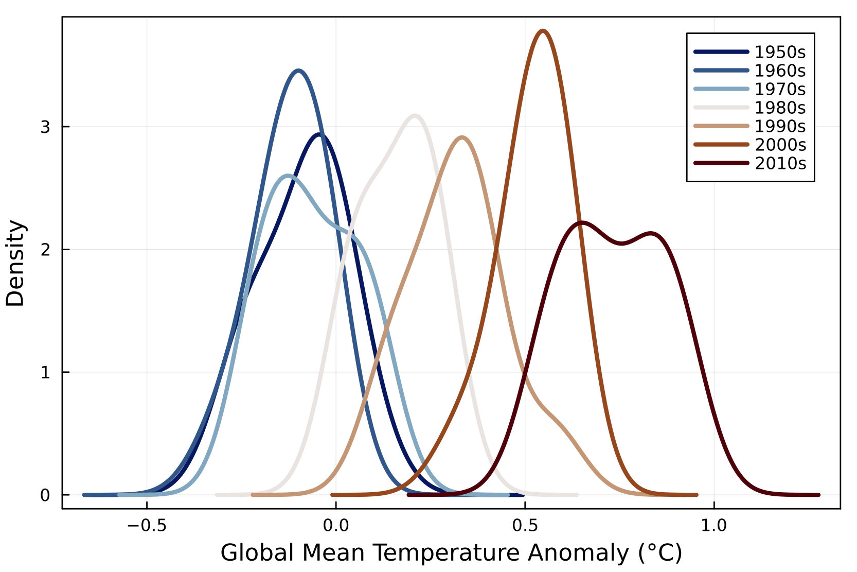
As Earth’s average temperature increases, the range of ‘normal’ temperatures also shifts. As the distributions shift to warmer temperatures with time, we can see in the figure below that temperatures that were extremely warm in the past have become average or even comparatively cold. This basic process therefore increases the number of hot temperature extremes.
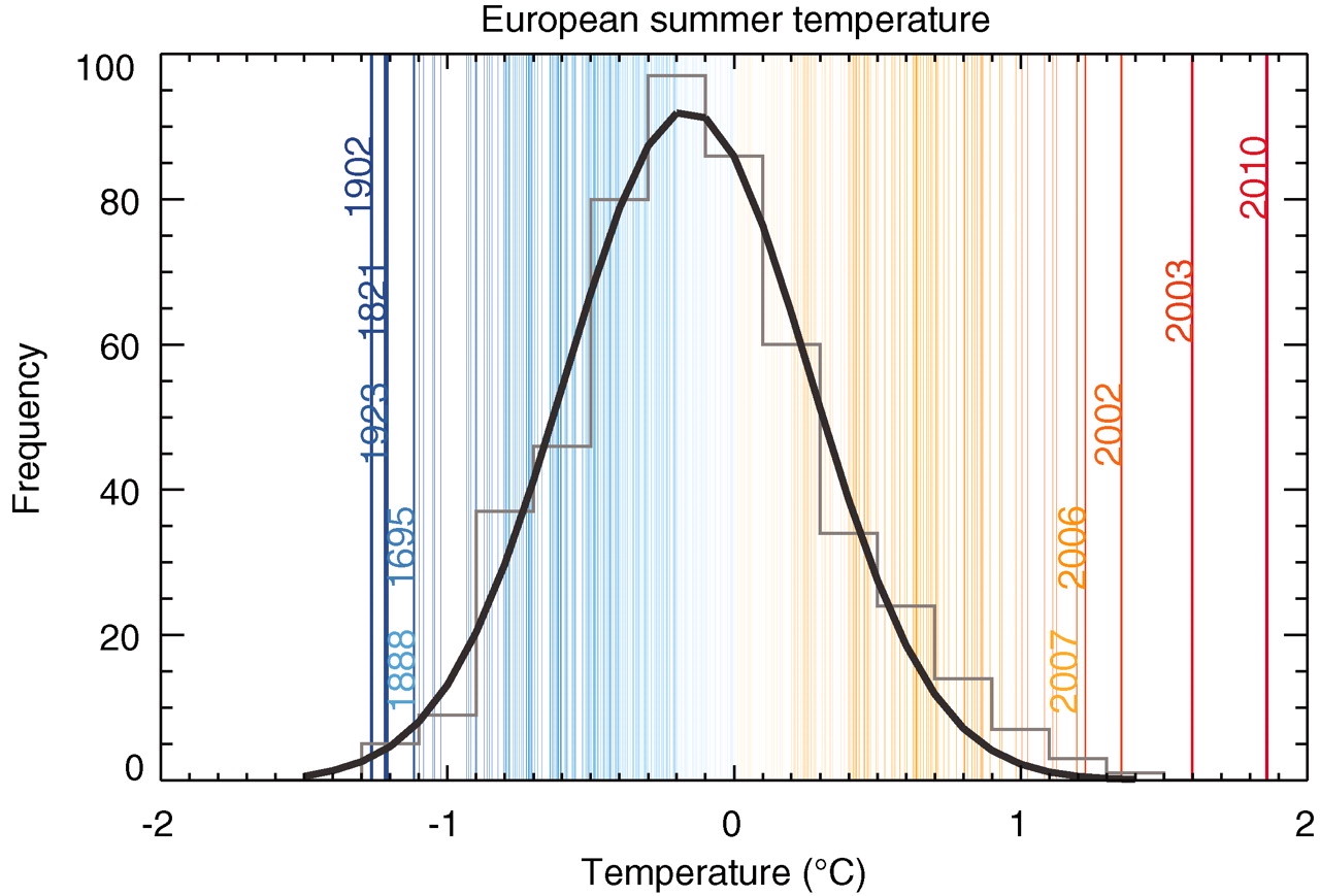
An example of this was a summer heat wave that occurred in 2010 primarily over central and eastern Europe. In the context of the past 500 years, the long heat wave made the 2010 European average summer temperature exceptionally warm and well beyond the boundaries of historical ‘normal’ temperatures (see figure below). In Russia the results of this heat wave were approximately 55,000 excess deaths and a 25% crop failure.Barriopedro et al., The Hot Summer of 2010: Redrawing the Temperature Record Map of Europe, (2011). These are the kinds of events that are expected to occur much more often due to global warming.
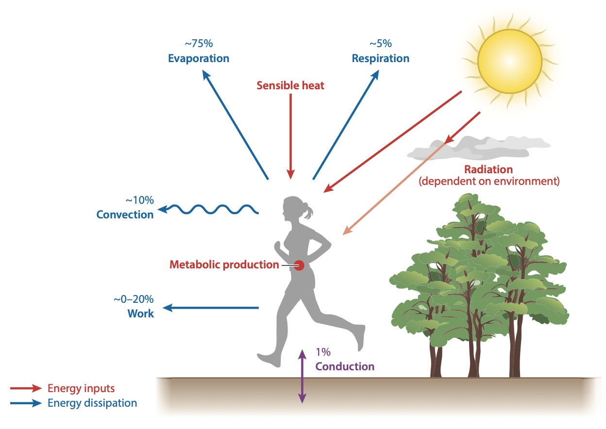
Extreme warmth can have many kinds of impacts, such as on food crops (discussed more below). But for high temperatures to directly kill people, they usually have to be accompanied by high humidity. Why is this the case? It has to do with how the body gets rid of heat. If the human body did not get rid of the heat it generates, then it would warm by 1ºC per hourPlatt and Vicario, Heat Illness, (2013). until it cooked itself to death. As long as we have access to water and can sweat, we can work in dry-heat conditions up to about 50ºC.Buzan and Huber, Moist Heat Stress on a Hotter Earth, (2020). The key mechanism that lets us endure this is our ability to lose heat through evaporation. When we sweat, the excess heat we produce can go into heating and evaporating the water on our skin; this removes heat from our bodies and we cool down. The figure below shows the energy balance of the human body while working or exercising. Evaporation can remove about 75% of the excess heat we produce (though only about 25% when we are at rest).
However this evaporative heating loss can be stopped if we experience humid or moist heat. If the air becomes too hot and too humid, we can no longer lose heat through evaporation and we risk heating up our bodies until they die.
Let’s look at what could happen under global warming in the cities of Jakarta (Indonesia) and New York City (USA). Currently there are relatively few days per year that are hot enough to directly cause death in these cities. But if we use a combination of historical heat wave data and climate model simulations of global warming, then we can calculate that both these cities see very large increases in the number of deadly heat days. The figure belowMora et al., Global Risk of Deadly Heat, (2017). shows temperature and humidity from a single model simulation for the year 2005 and the year 2100 under three different CO2 emissions scenarios: RCP 2.6 represents a low-emissions scenario, RCP 4.5 a middle of the road scenario, and RCP 8.5 a high-emissions scenario. The top row of plots are for Jakarta, while the bottom row of plots are for New York City. The average values for all the days of the year are dots that are connected in time by lines. The red line indicates the threshold of temperature and humidity that cause death (values on the right side of the red line are deadly). The numbers on the plots indicate the number of deadly days and the average temperature change in 2100 compared to 2005.
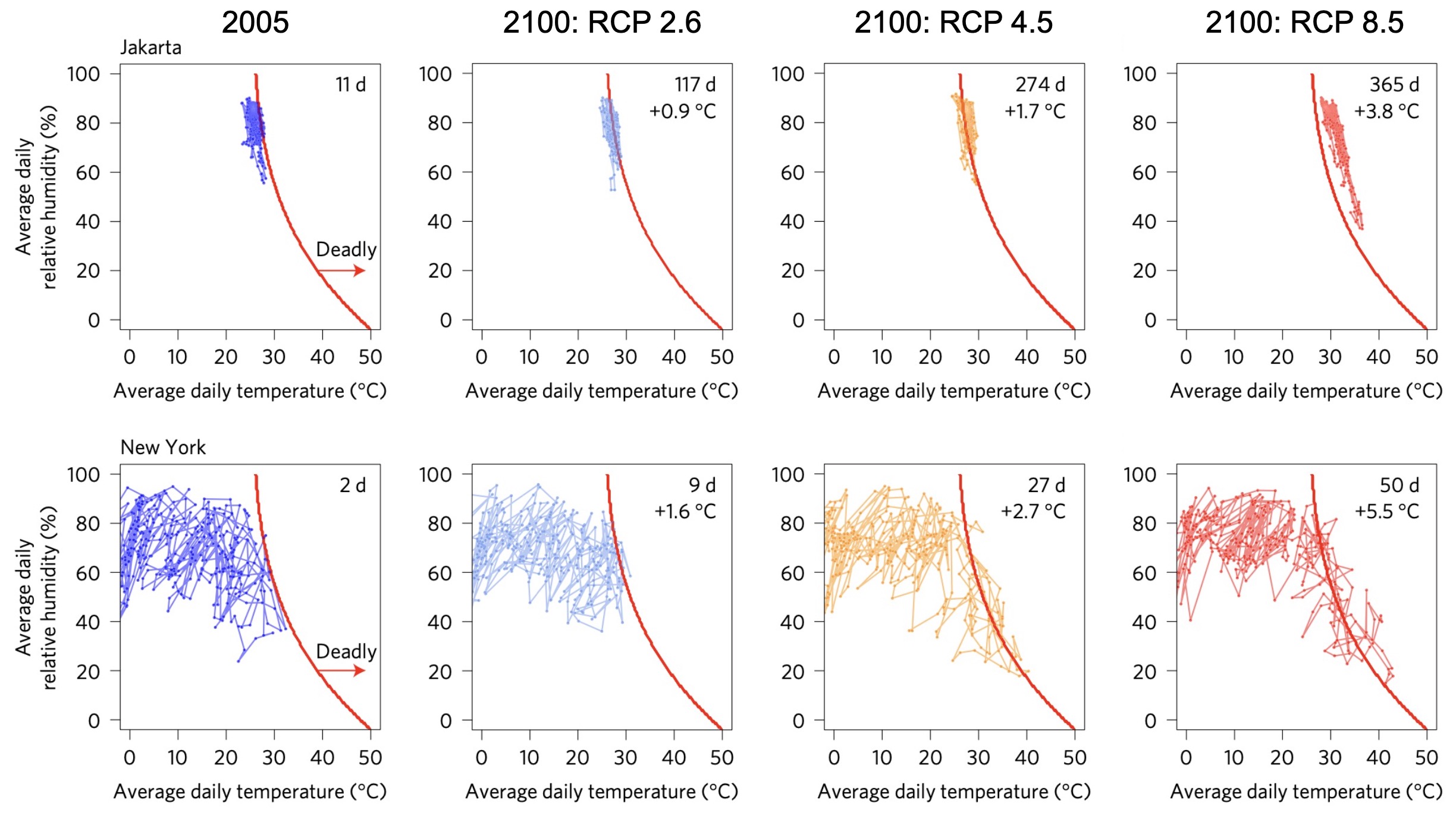
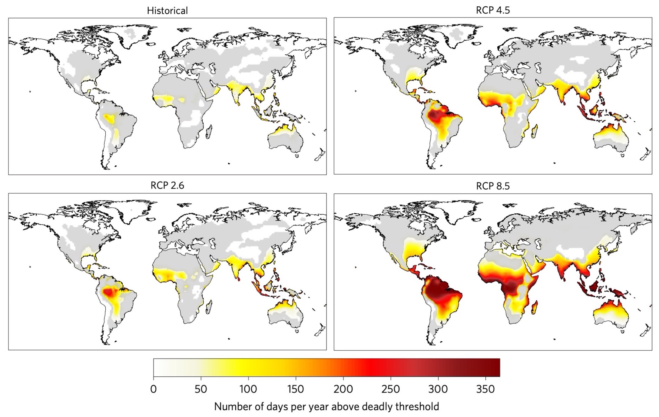
By 2100 in the middle of the road scenario (RCP 4.5), New York City will have about a month’s worth of deadly heat days each year while in Jakarta about 75% of the days will be hot enough to kill. If we look at this same analysis but using many different climate models (below), we see that by the year 2100 most of the tropics will experience deadly heat for a majority of the year. These tropical regions are home to a large fraction of the human population. Depending on the emissions scenario, by 2100 between about 50% to 75% of the world’s population will experience more than 20 days of deadly heat per year.Mora et al., Global Risk of Deadly Heat, (2017).
Destructive Storms
Water
With global warming, the projected changes in precipitation will be more complex than they will be for temperature. The figure below shows what the changes will look like for average precipitation versus daily extreme precipitation, for the case of 4ºC of global mean temperature warming.
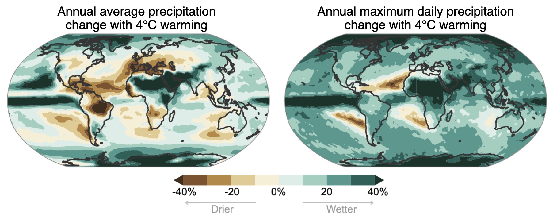
Average precipitation increases in much of the tropics and the regions near the poles, while it decreases in many areas that are in-between, such as in the Mediterranean. But if you look at daily extreme precipitation events, these get wetter nearly everywhere; this is mostly explained by the fact that the atmosphere can hold exponentially more water vapor at higher temperatures, as we learned in our discussion of the water vapor feedback.
If average precipitation increases in a lot of places and extreme precipitation goes up almost everywhere, it seems like that should make the soil wetter and thus plants happier in the future. But it turns out this is wrong! If we look at soil moisture in the figure below, soils get drier in most locations for every global warming scenario. How is this happening in locations that get more preciptiation on average as well as more extreme precipitation events?
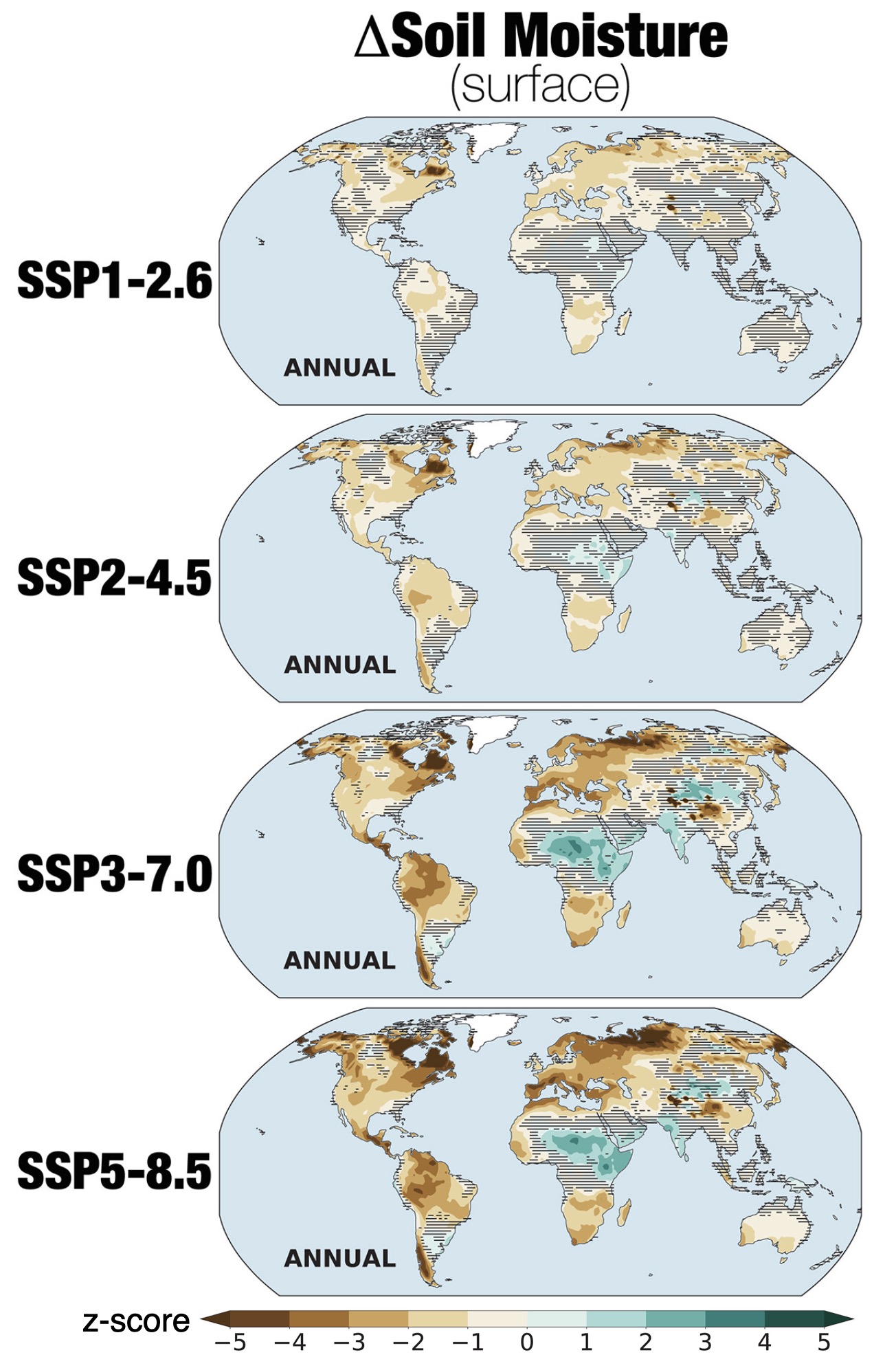
The amount of moisture in soil is determined by a competition between precipitation and evaporation. If the rate of precipitation is the same as the rate of evaporation, the soil moisture will remain constant and balanced by the two processes. But if evaporation increases even more than precipitation, then this can lead to drier soil. Evaporation increasing more than precipitation explains the drying soils in most locations on Earth in the above figure.
How does all of this relate to droughts? Droughts are usually determined by soil moisture levels because soil moisture is what plants and crops care about. So if the soil moisture is low for a long period of time, that constitutes a drought. Because soil moisture decreases in most locations, that means that there will be an increase in the number and severity of droughts in most locations on Earth.Seneviratne, et al., Weather and Climate Extreme Events in a Changing Climate. In Climate Change 2021: The Physical Science Basis. Contribution of Working Group I to the Sixth Assessment Report of the Intergovernmental Panel on Climate Change, (2021).
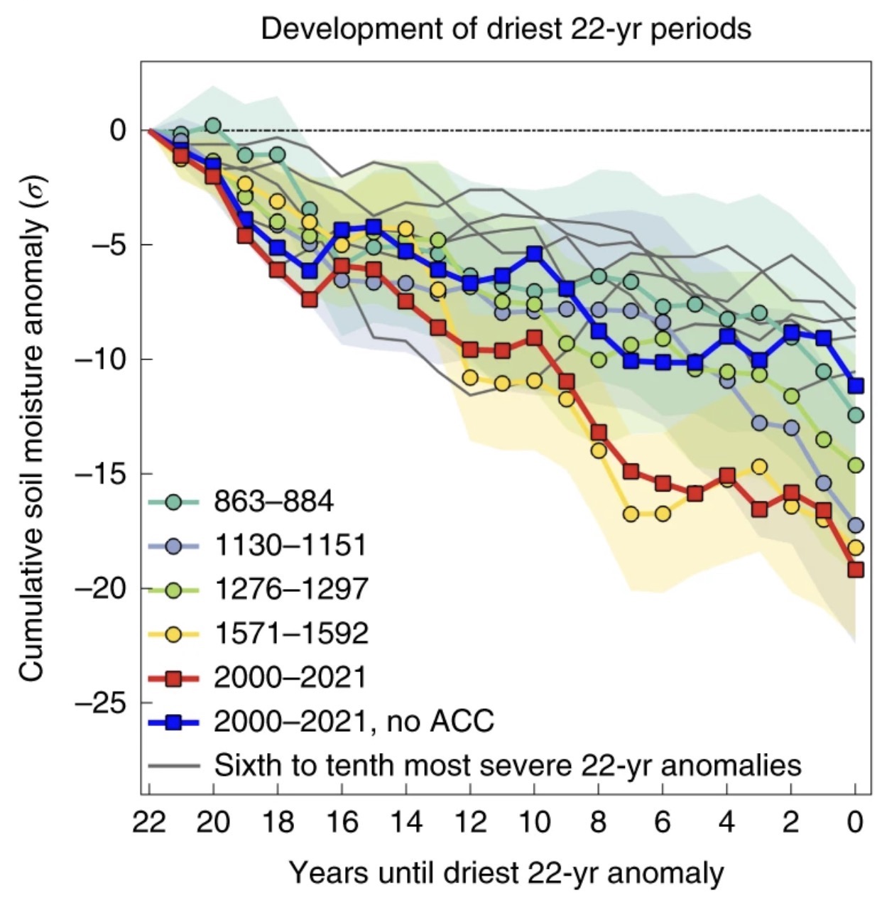
Consider an example of a contemporary ‘megadrought’ in the North American Southwest. The figure below compares a megadrought from 2000 to 2021 (red line) to soil moisture from the driest 22 year periods over the past 1,200 years (light-colored lines). This contemporary megadrought clearly stands out as among the very worst. The blue line in the figure shows what the drought would have been like without the influence of global warming. Global warming has taken what would have been an average severe drought and turned it into one of the worst in over a thousand years.
Food
Cultivated plants, or ‘crops’, are the foundation of all food. The total amount of food that crops provide, the ‘yield’, depends on both soil moisture and temperature. Yet with global warming, extreme temperatures are very likely to be more important for crop yields than extreme precipitation. This is because global warming directly increases temperature extremes and droughts through evaporation, but only fractionally increases precipitation extremes. Specifically, warming directly increases global average atmospheric water vapor by 6-7% per ºC, but only increases global average precipitation by 2-3% per ºC;Allen and Ingram, Constraints on future changes in climate and the hydrologic cycle, (2002). thus precipitation only increases by about 1/3 of its full potential. Additionally, crops will be more affected by warming because it is much harder to breed crops for extreme heat tolerance than drought tolerance.
Plants have a fundamental range of temperatures that they prefer to live in and if that range is exceeded, the plants will produce less or even die. The figure below shows how crop yields, in general, are related to temperature (gray line). Very low temperatures make crops/plants grow slowly or incompletely, producing a very low yield. The yield then increases with increasing temperature. But once the temperature becomes too warm, the yield dramatically drops and will go to zero when the plants die.
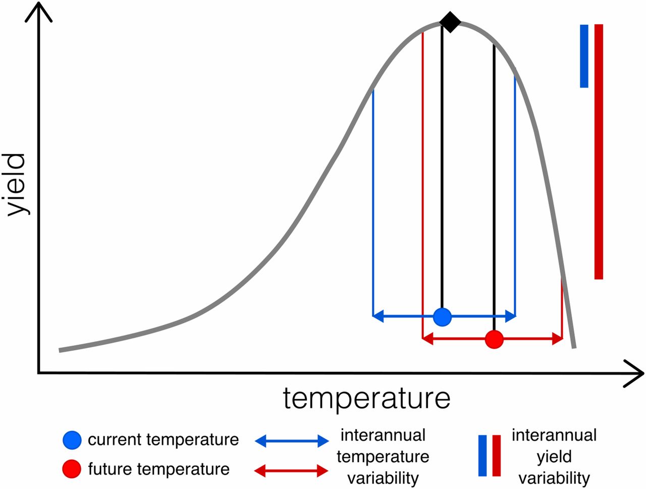
The figure also shows two example scenarios: a ‘current’ year-to-year temperature range (blue) that produces yields that are close to ‘optimal’ and another ‘future’ year-to-year scenario (red) where the mean temperature increase makes the yield be near optimal some years, but very low in other years. The range of year-to-year yield variability in the blue ‘current’ scenario is relatively small (blue vertical line), while it is very large in the red ‘future’ scenario (red vertical line). More yield variability or volatility can cause extensive problems for both farmers and consumers. Without relatively consistent yields, farms would collapse (because they could not consistently pay their bills) and there would be significant food shortages.
Because global warming is happening everywhere, it increases yield volatility nearly everywhere.Tigchelaar, et al., Future warming increases probability of globally synchronized maize production shocks, (2018). This also increases the likelihood that multiple places could simultaneously experience crop failure. For example, the United States, Brazil, Argentina, and Ukraine together grow about 90% of the world’s maize (or ‘corn’ as it is known in North America). Currently the probability is almost zero that all four countries will experience a large yield loss of more than 10% in the same year. But with a global warming of 2ºC, this increases to a 7% chance and with 4ºC of global warming this increases to an 86% chance for any given year.Tigchelaar, et al., Future warming increases probability of globally synchronized maize production shocks, (2018).
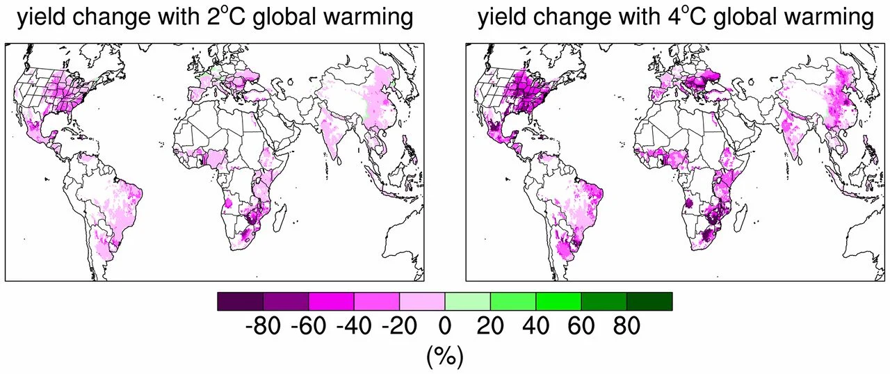
Across several different kinds of experiments, it has been shown that for every degree Celsius of warming above the current average temperatures, crop yields decrease on average about 6.0% for wheat, 3.2% for rice, 7.4% for maize, and 3.1% for soybeans.Zhao, et al., Temperature increase reduces global yields of major crops in four independent estimates, (2017). But non-linear effects can be large for larger amounts of warming and yield losses can be larger for some regions than others. For example, in Tigchelaar, et al. (2018) they found about 0 to 40% loss for most places with 2ºC and from 0 up to about 80-90% changes for 4ºC, see figure below.
A common argument that is made about global warming and crops is that increasing CO2 will actually bring net benefits to crops, called the ‘CO2 fertilization effect’. This effect is founded on the fact that plant cells are built around the element carbon and that plants get this carbon from CO2 in the atmosphere (not from the soil). So increasing CO2 increases the availability of carbon to plants, thus making it easier for them grow (specifically, increasing CO2 increases the rate of photosynthesis). You can see this effect in experiments. The figure below shows rice and grass (Setaria viridis) that have been grown at different levels of CO2 while holding everything else constant.
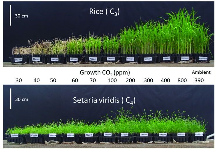
Clearly more CO2 makes the plants greener and leafier. But how does this impact crop yields and nutrients, the quantities that we humans actually care about? This can be tested in the lab as well as out in fields where CO2 is constantly pumped out over crops.
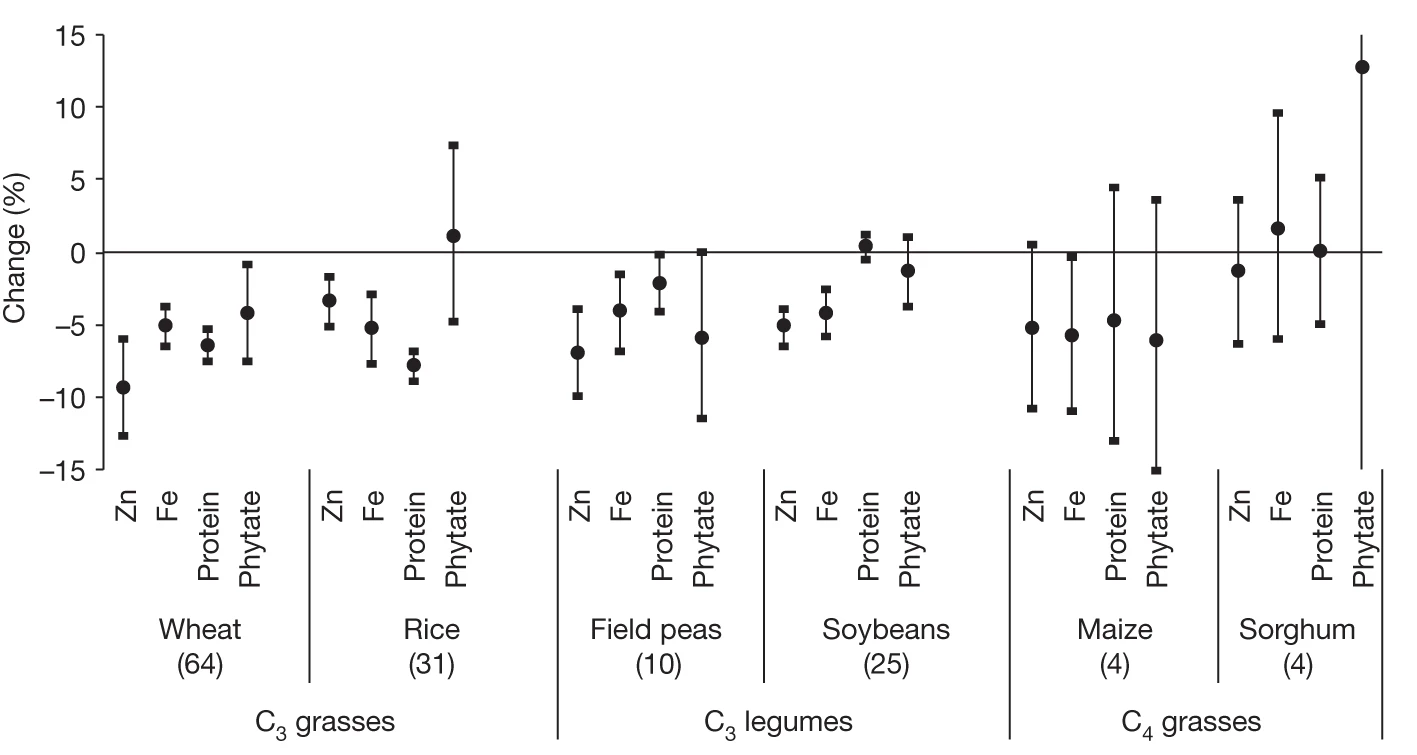
In these experiments, as CO2 is increased to about 550 ppm, yields generally increase. However, yield increases vary quite a lot by region, crop, and soil type, anywhere from 0-24%.McGrath and Lobell, Regional disparities in the CO2 fertilization effect and implications for crop yields, (2013); Kimball, Crop responses to elevated CO2 and interactions with H2O, N, and temperature, (2016). What about nutrition changes? The figure below shows the average change in nutrients of different crops across 143 total field experiments where CO2 was increased to about 550 ppm. You can see that nearly all crop types become less nutritious with increasing CO2.
So how are crops affected if we put the major factors together: CO2 increases plus temperature increases plus drought increases? Crop nutrients clearly go down.Toreti et al., Narrowing uncertainties in the effects of elevated CO2 on crops, (2020). If CO2-driven temperature changes can remain mostly within a crop’s optimal growing conditions, then CO2 fertilization can make temperature-caused yield losses be about half as bad as they might otherwise have been.Rosenzweig et al., Assessing agricultural risks of climate change in the 21st century in a global gridded crop model intercomparison, (2014). But if drought and temperature extremes increase enough, the crops will die and no amount of CO2 fertilization can change that.Kimball, Crop responses to elevated CO2 and interactions with H2O, N, and temperature, (2016).
Economic Risks
So far we’ve covered some of the most important physical impacts of global warming. There are many others that could also be discussed. An economic perspective tries to reduce most of these impacts down to a dollar amount or to a percentage of global gross domestic product (GDP). It’s a limited frame of reference to see the world only in terms of its monetary value. Yet this is still an important frame of reference to view the impacts of global warming.
Estimating the economic impacts of global warming is incredibly challenging. The entire global economy in all its complexity must be modeled according to a relatively small set of mathematical equations. And because the global economy is not a physical or chemical system, every equation in the economic model is parameterized (similar to how some equations in a global climate model must also be ‘parameterized’). The largest source of uncertainty in these economic models usually comes from estimating the model parameters using the limited available historical economic and climate data.Wagner and Weitzman, Climate Shock: The Economic Consequences of a Hotter Planet, (2015); Burke, Davis, and Diffenbaugh, Large Potential Reduction in Economic Damages Under UN Mitigation Targets, (2018).
The economic impacts of global warming will also depend on the amount of greenhouse gases we emit and on Earth’s true climate sensitivity. Recall that climate sensitivity is defined as the global mean temperature response to a doubling of CO2. It is reasonable to expect that we will eventually emit more than a doubling of CO2; for the SSP ‘middle of the road’ scenario, CO2 levels will eventually reach about 700 ppm. Also recall that when accounting for uncertainties, the estimate of climate sensitivity is a fat-tailed distribution, skewed towards the higher values. So the temperature change for an eventual CO2 level of 700 ppm would be given by the following distribution.
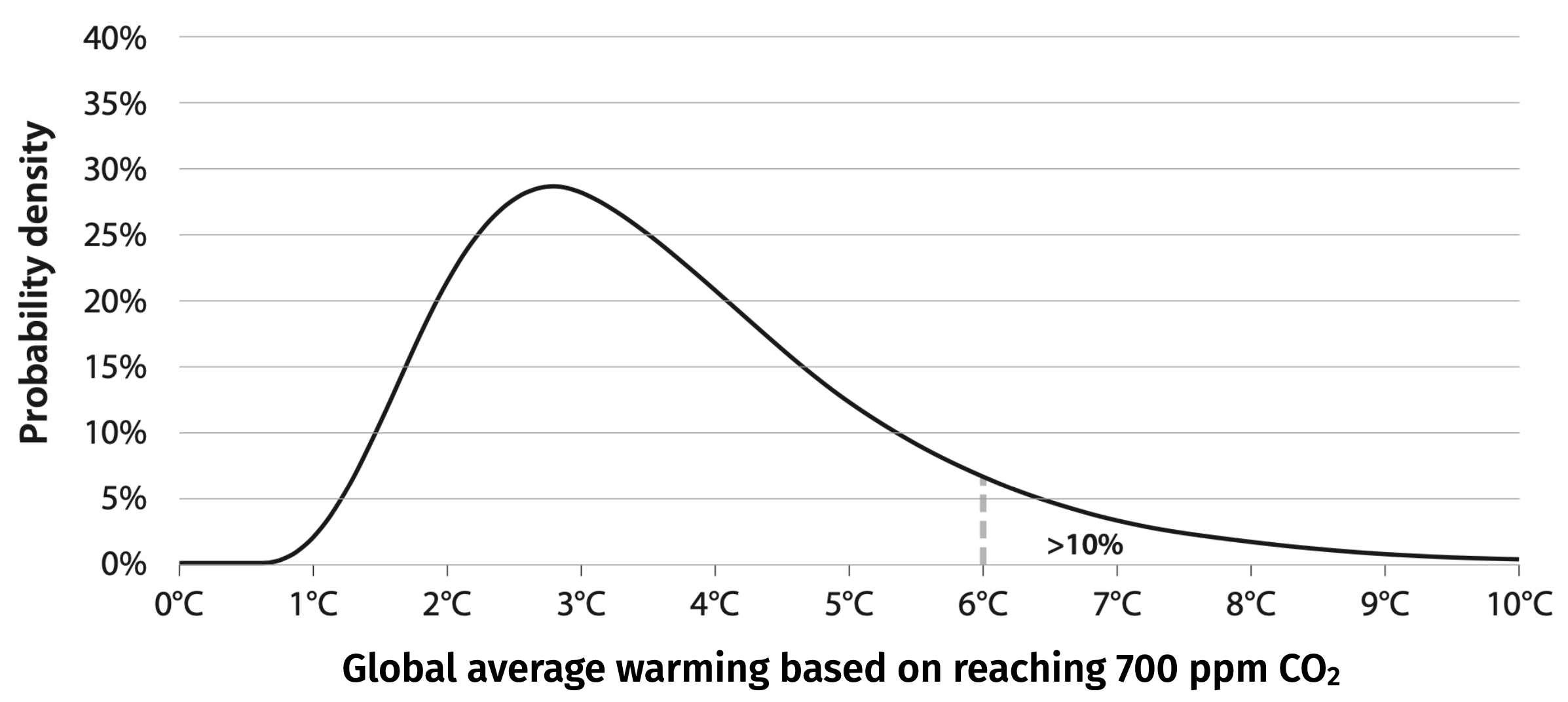
Because the distribution is fat-tailed, the highest values can’t be ruled out. For example, there’s a 10% chance that the Earth will warm by more than 6ºC (as indicated on the figure), which is more than double the most likely estimate. A 10% chance might feel unlikely, but many personal catastrophes (like a house fire or severe car accident) that we spend a lot of effort and money to insure against are far less probable. A truly rational response to global warming ought to take very seriously the possibility of ‘unlikely’ extreme warming.
The figure below shows the results of one prominent approach to estimating the economic impacts of global warming while accounting for the major sources of uncertainty. It shows the change in global per capita GDP as a function of temperature, relative to a world without warming, using a range of global warming scenarios: RCPs 2.6, 4.5, 6.0, and 8.5 for the year 2049 and the year 2099. For example, consider the amount of warming expected by 2099 under the 2015 UN Paris Agreement, the gray shaded area that spans about 2.5-3ºC; in this scenario we see that the world will lose about 20-30% of its total economic value by 2099, compared to a world without global warming.
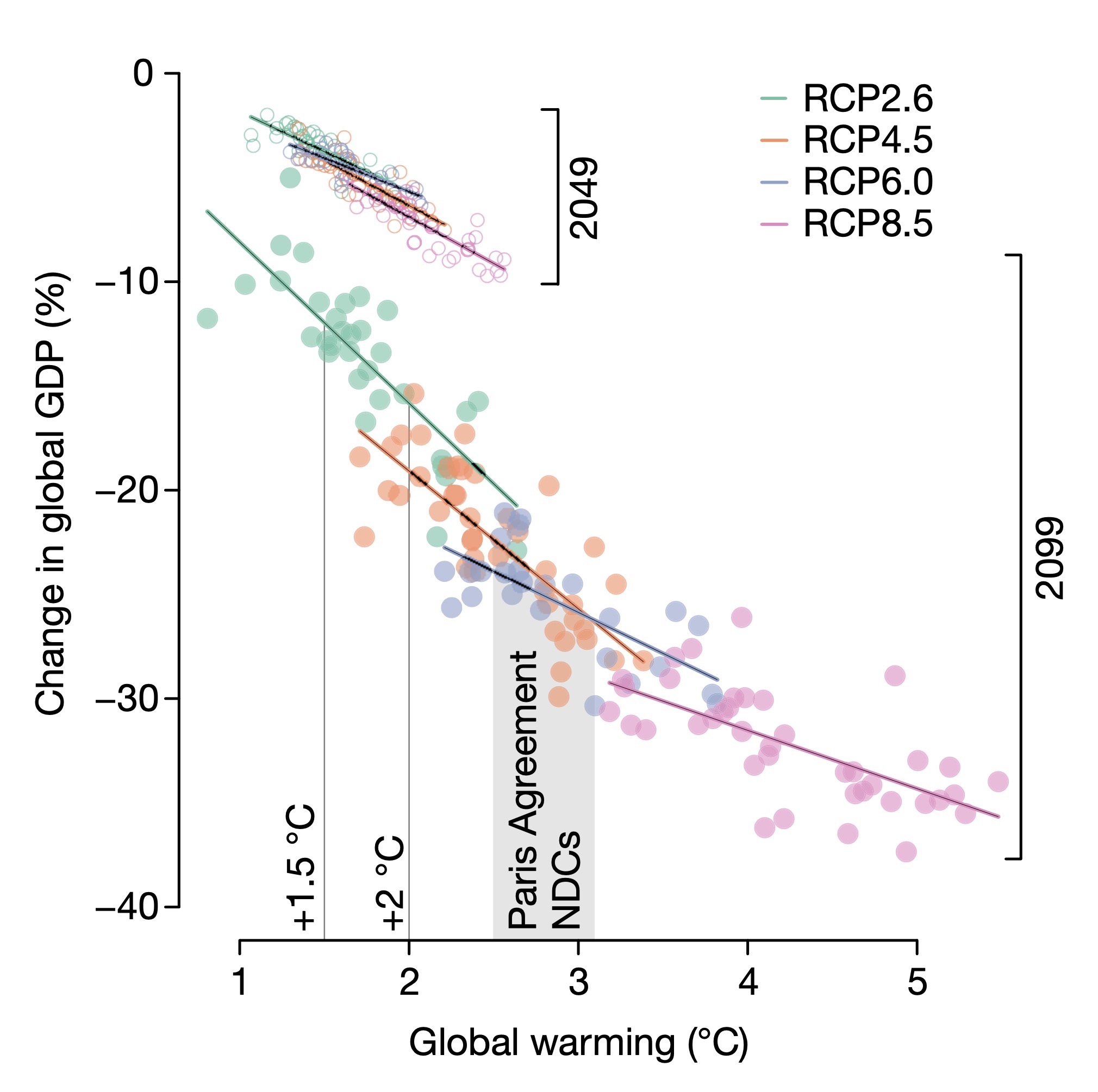
Note that different economic modeling approaches give different ranges of results. The first such economic models that were made estimated global GDP loses of 2-10% by 2100.Nordhaus, The Climate Casino, (2013). But these models were simplistic and didn’t account for things like the change in the frequency and severity of natural catastrophes; also, they made only a partial account (or even no account at all) of the uncertainties we’ve discussed.Wagner and Weitzman, Climate Shock: The Economic Consequences of a Hotter Planet, (2015). Most recent economic modeling gives results that are approximately consistent with the results shown in the figure above.For example the reinsurance company Swiss Re used a different modeling approach and estimated a global GDP loss of about 1-11% for a 2ºC warming by 2049, while Burke et al.’s estimate is about 3-8%. Guo, Kubli, Saner, The Economics of Climate Change: No Action is Not an Option, (2021). Though current approaches do not account for unprecedented ‘tipping points’, such as the partial collapse of the West Antarctic Ice Sheet or the collapse of a particular biosphere; if these were to happen, the economic consequences would be enormous. And of course if the worst-case scenario were to occur and Earth were to go into a moist greenhouse state then the economic cost would be the value of the entire Earth.
\(\Uparrow\) To the top
\(\Rightarrow\) Next chapter
\(\Leftarrow\) Table of contents